
Widget Types
Detailed guide to all eight dashboard widget types in Sensorclouds
Sensorclouds dashboards support eight widget types, each designed for a specific visualization need.
Widget configuration modals are organized into collapsible sections, so you can focus on one group of options at a time.
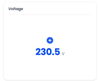
Value Card
Displays a single telemetry value with a label and optional icon. Ideal for current temperature, battery level, or any single metric.
Configuration: Device, field, title, icon, unit
Enhancements:
- Conditional color rules - color the value by thresholds
- Configurable decimals and icons
- Trend indicator comparing against the previous value
Gauge
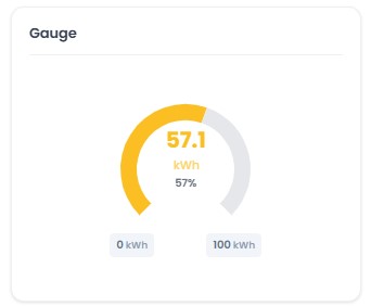
A semicircular gauge meter with configurable min/max range and color thresholds for visual status indication.
Configuration: Device, field, min value, max value, threshold colors, unit
Example thresholds:
- Green: 0–30 (normal)
- Yellow: 30–40 (warning)
- Red: 40+ (critical)
The gauge was reworked with cleaner color-zone bands, a smoother value arc, and refreshed display options.
Line Chart
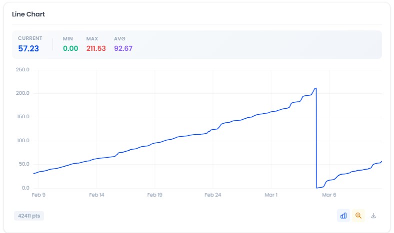
Time-series line chart that plots historical data points over a configurable time range.
Configuration: Device, field, line color, aggregation method, time range
Enhancements:
- Threshold lines with custom colors (native color picker)
- Y-axis min/max controls and a compact stats strip
- Threshold breach indicator in the chart toolbar
- Optional threshold sound alerts with edge detection and cooldown
Bar Chart
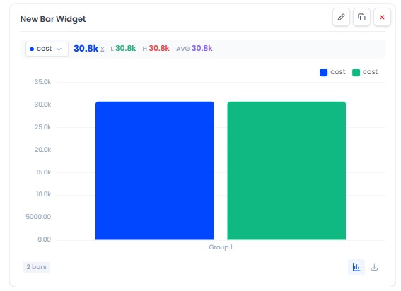
Compares values across time buckets or across devices/metrics.
Modes:
- Time-bucketed - aggregate a field into buckets (e.g. daily totals) over the selected window
- Categorical / grouped - pivot devices against metrics: compare the same metric across many devices, or many metrics for one device
Options:
- Bucket interval (time-bucketed mode, e.g.
1d) - Compare-by axis selector (choose what the bars are grouped by)
- Custom group builder (define your own groupings)
- Per-series color and label, with clear series cards
- Null gaps are preserved (missing buckets are not silently filled)
Ideal for: daily energy/water totals, per-device comparisons, category breakdowns.
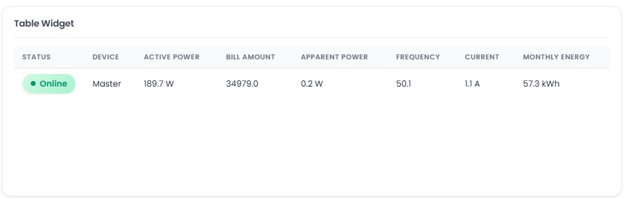
Table
Tabular display showing the latest values for multiple telemetry fields across one or more devices.
Configuration: Devices (multiple), fields, column labels
Indicator
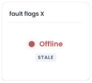
A status light for discrete or connectivity states - shows a colored state with an optional label, icon, and "last updated" age.
Two modes:
- Value match - define rules that map a field's value to a state, color, label, and icon (e.g.
0= Closed/grey,1= Open/green) - Staleness - derive state from data freshness: fresh / stale / offline based on how long since the last reading
Options: show/hide label, icon, and last-updated time; blink on a chosen state; a default state for when there's no data yet.
Ideal for: online/offline status, open/closed sensors, run/idle/fault states.
Toggle
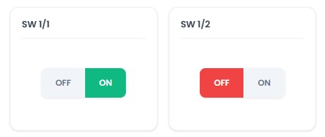
An interactive on/off switch that sends commands to devices. Supports confirmation dialogs, custom labels, and optimistic UI with rollback on failure.
Configuration: Device, command name, on/off values, labels, icons, confirmation toggle
Layout options: Classic and modern styles
Toggle widgets are the only widget type that crew users can interact with. All other widgets are read-only for the User role.
Timeseries Table
A paginated historical data table with sortable timestamps and configurable decimal precision. Supports CSV export for data analysis.
Configuration: Device, fields, page size, decimal places
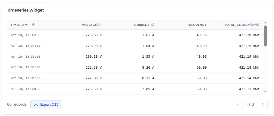
CSV export availability depends on your tenant profile settings. Check with your administrator if the export button is not visible.